Stubbs
Brand identity
Naming & Visual Identity
Typography
Creative Direction
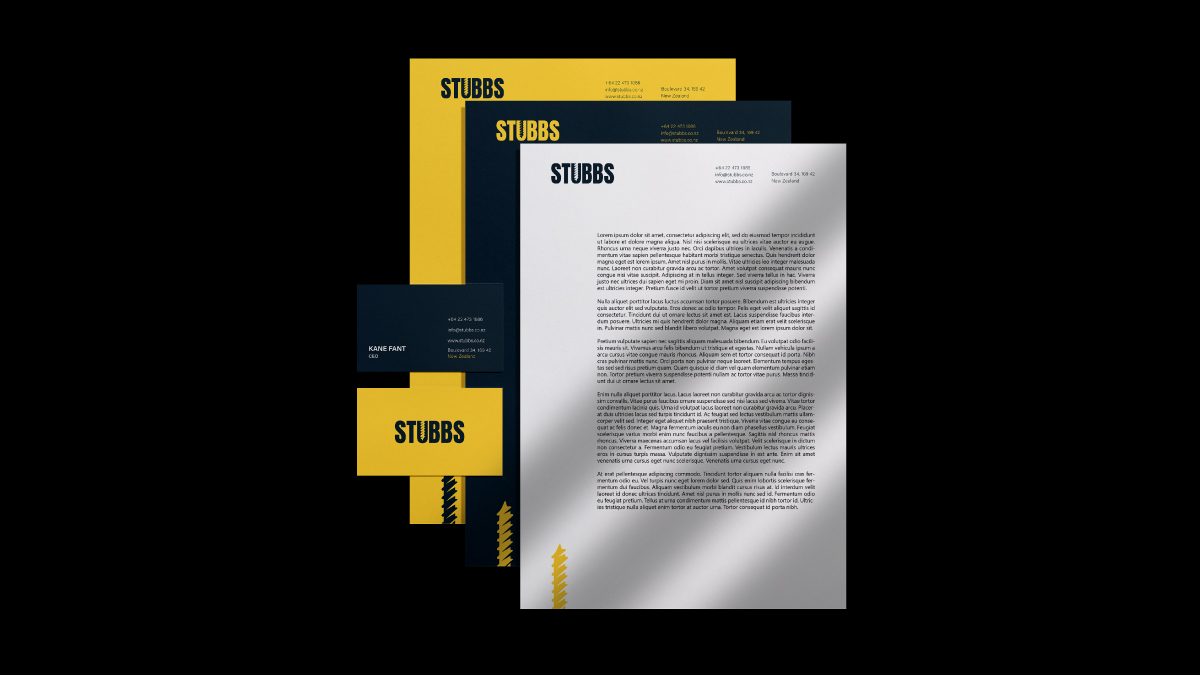
Stationery Design
Brand Guidelines
Urban Environmental Graphics/Signage
The Challenge
Brief design requirements: a modern, non-overloaded, minimalistic, and user-friendly logo design that emphasizes the company’s style. The goal was to create an identity that not only represents the values of the construction business but also resonates with the target audience.
The Approach
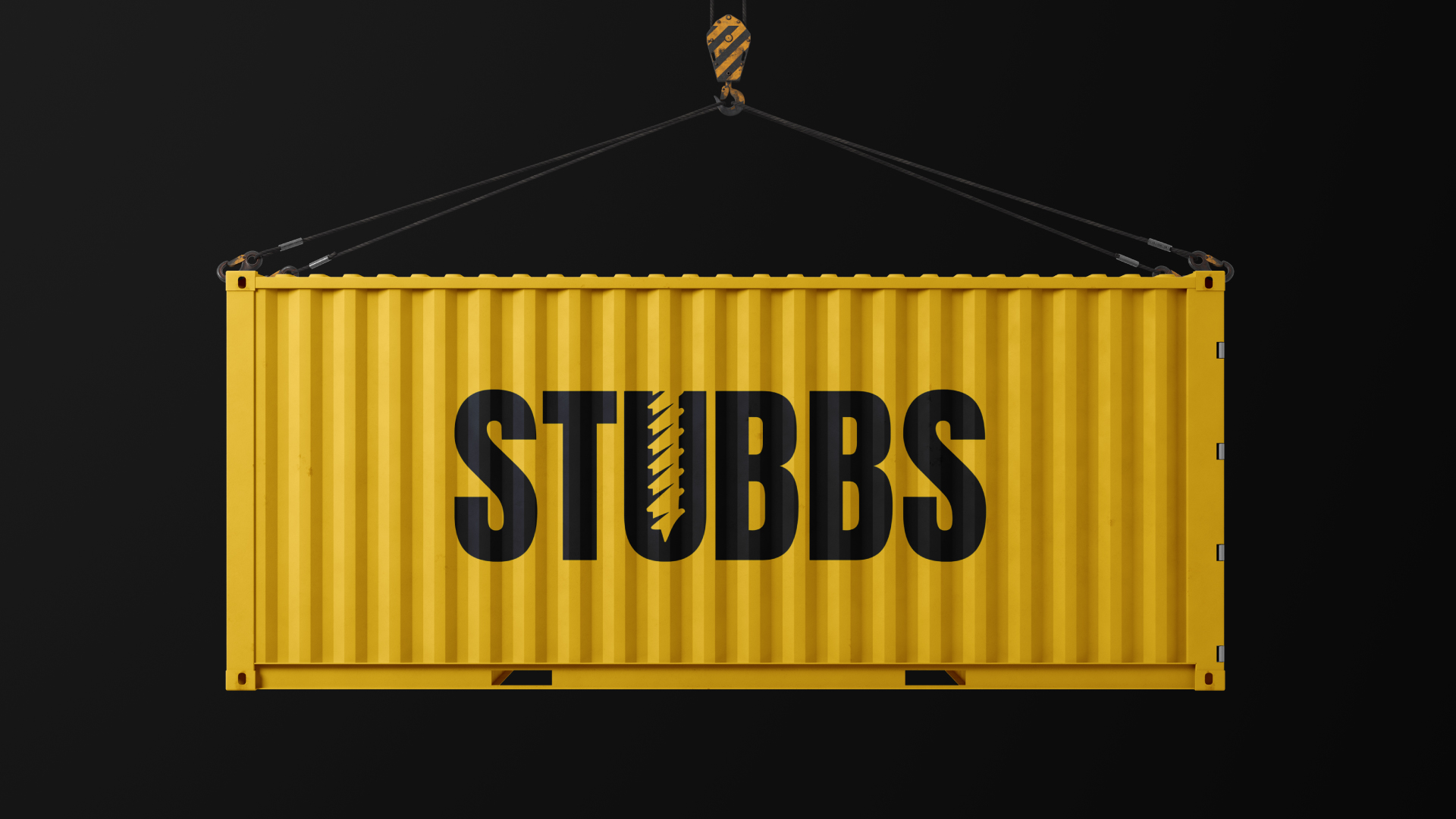
Turning ideas into precision with the innovation of a screw and the twist of excellence. By utilizing negative space, we’ve artfully formed a screw within the letter ‘U’ of the logo, creating a concealed image. The screw, a simple yet well-known machine, serves as a central symbol for the company. Symbolically, it represents the notion of pressing forward, even in the face of challenges that may hinder accomplishment.
your vision into exceptional , inspiring lives with , where every project is a masterpiece
