Frapantmobile bar
Overview
Brand Identity
Naming & Visual Identity
Typography
Creative Direction
Stationery Design
Print & Packaging
Illustration & Iconography
Campaigns
Urban Environmental Graphics/Signage
Social Media Content
Verbal identity & Copywriting
Marketing Strategy & Messaging
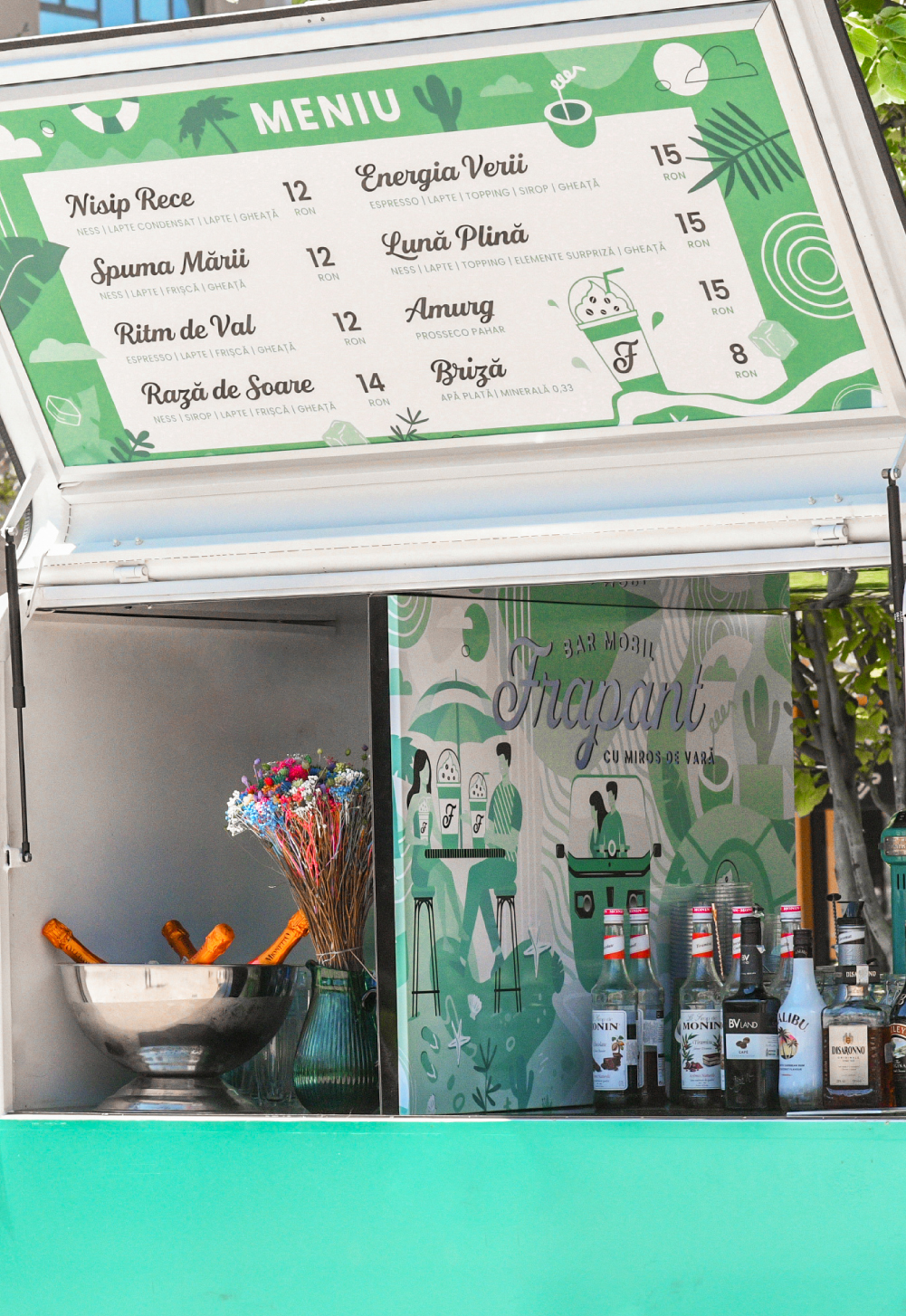
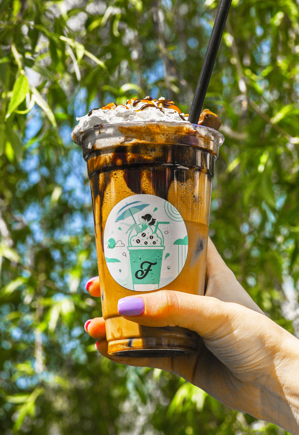
A brand concept that accentuates the yearning to savor the summer breeze, both in sensation and taste, all year round.
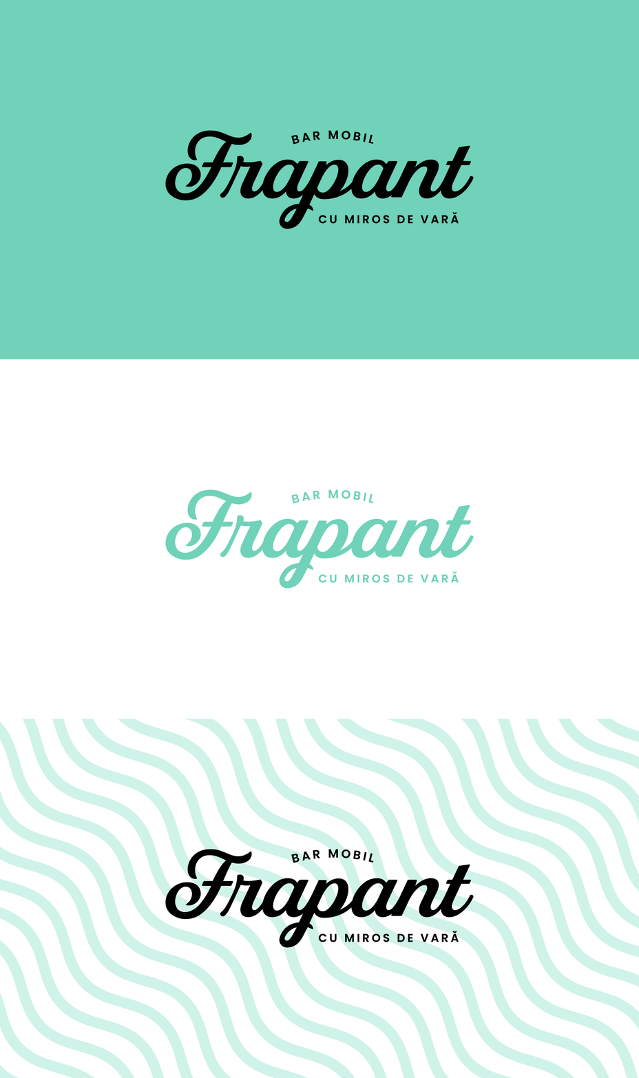
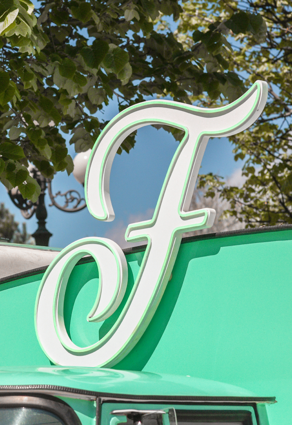
The central element of the logo is a stylized uppercase letter ‘F,’ gracefully transforming into a gentle wave. This fluid wave symbolizes movement and dynamism, striking a harmonious balance between water and fluidity.
The chosen font is modern and clean, reflecting professionalism and simplicity. The turquoise color, associated with water, evokes a refreshing feel, making it a popular choice for beach-inspired designs like Frapant.
The overall design is kept simple and elegant, ensuring it remains visually appealing and memorable. This simplicity allows for versatility in various applications, from digital platforms to print materials.
SUMMER VIBES IN FRAPANT LINES WITH OF ON COLD SAND
