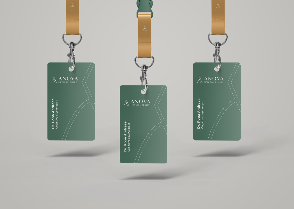
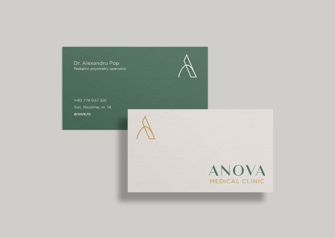
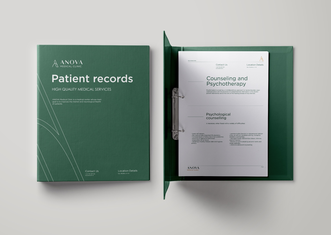
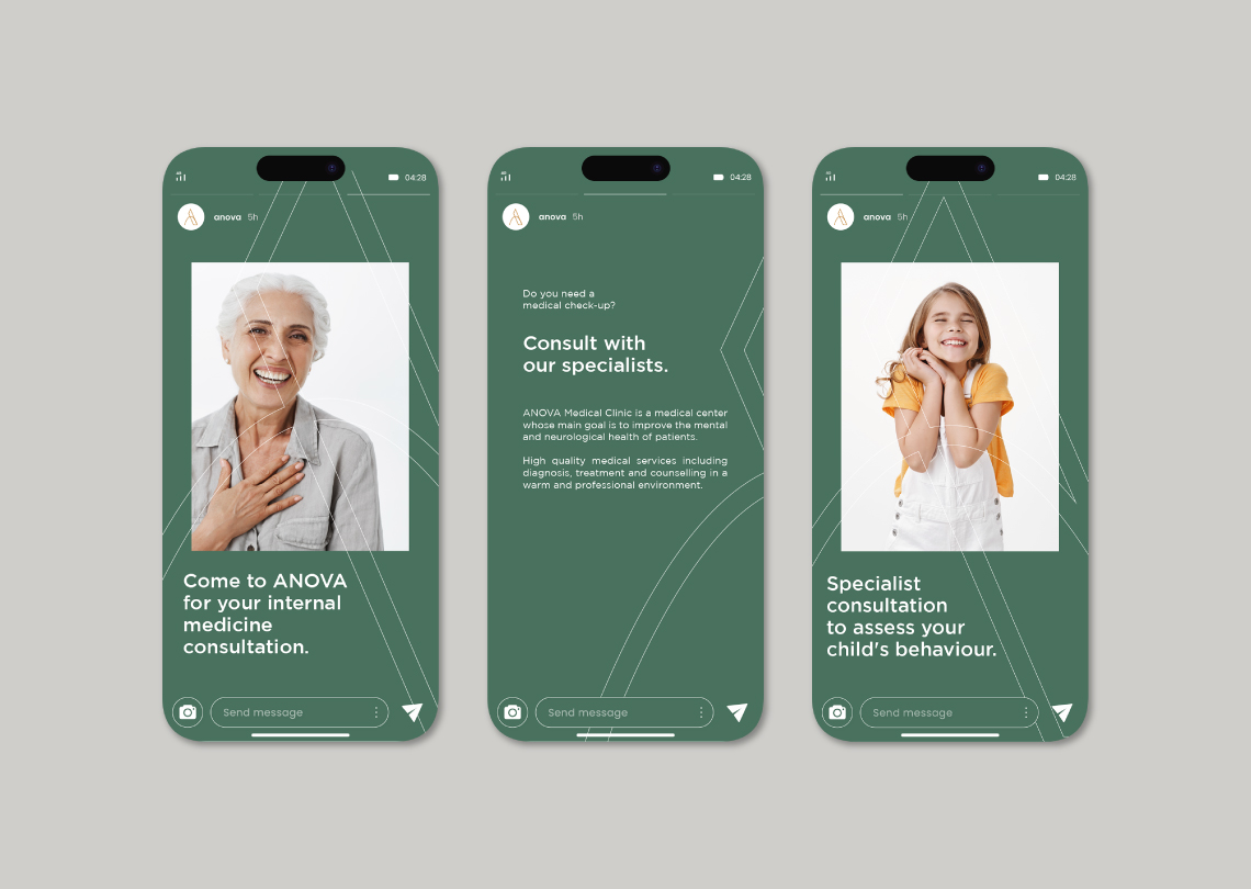
ANOVA Medical Clinic focuses on enhancing the mental and neurological health of patients through specialized care and innovative approaches.
Brand Identity
Creative direction
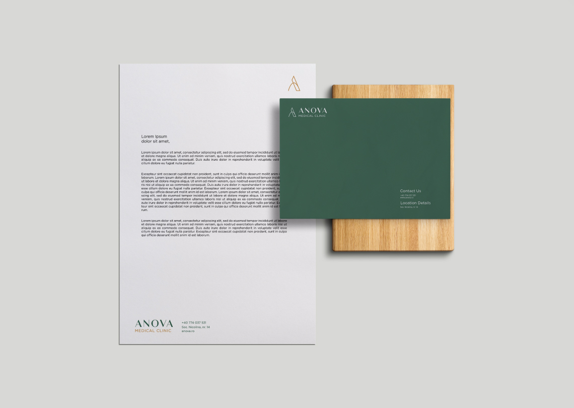
Print Design
Stationery Design
Web Design
The Challenge
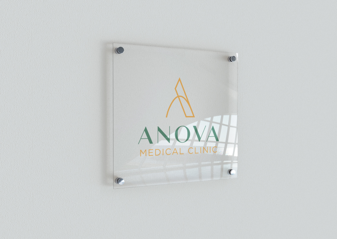
Capturing the essence of specialized care and innovative approaches for mental and neurological health, the logo must visually convey compassion and support. It reflects the commitment to comprehensive well-being, balancing medical professionalism with a welcoming atmosphere. Crafting a thoughtful and impactful design is essential to represent the clinic’s unique approach to healthcare.
The Approach
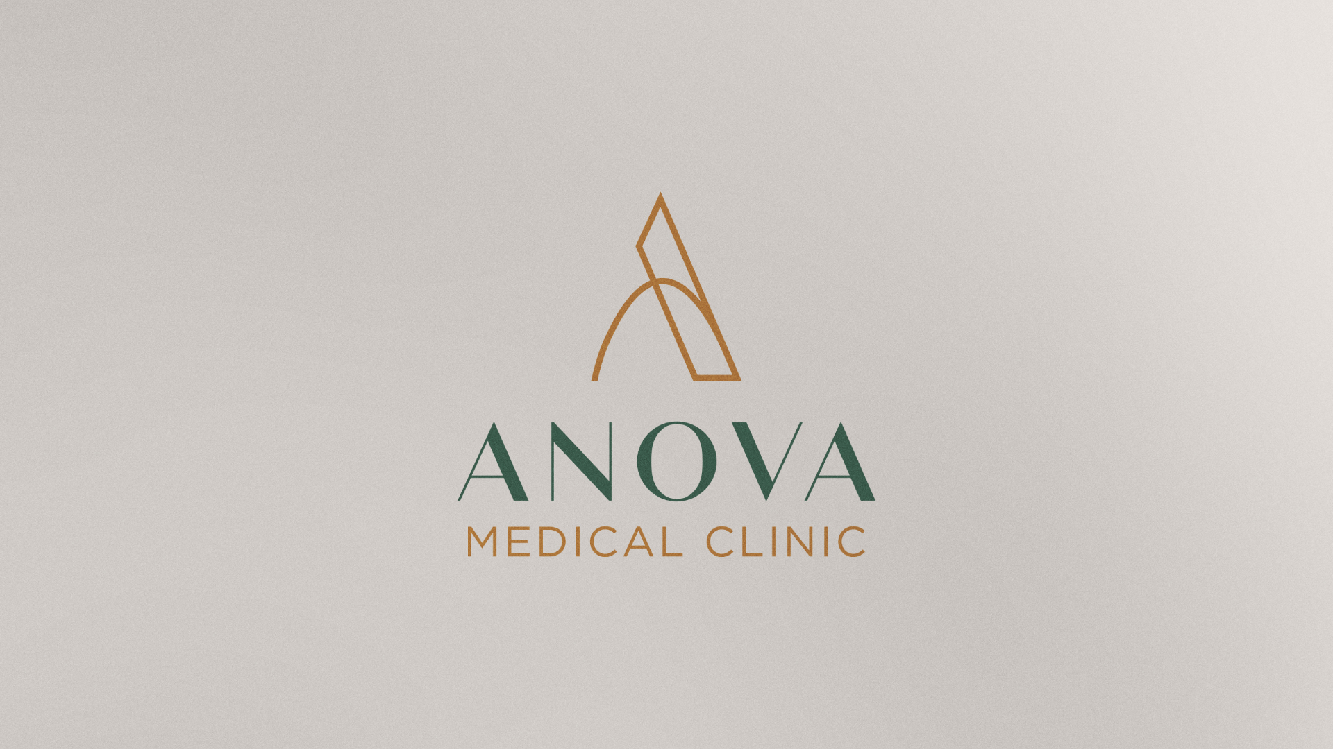
The logo is visually represented by the initial letter of the name using the graphic language of straight lines and curves. Descriptively, it is inspired by the Gaussian Curve, and metaphorically, it signifies the various oscillations encountered throughout life, with the ultimate goal being the pursuit of equilibrium. This symbolism reflects the intricate interplay of medical parameters influenced by the fundamental laws governing living organisms.
