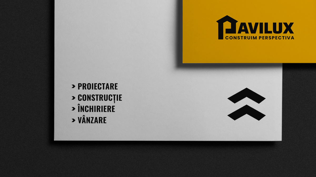
Pavilux
Brand identity
Digital Design
Typography
Creative Direction
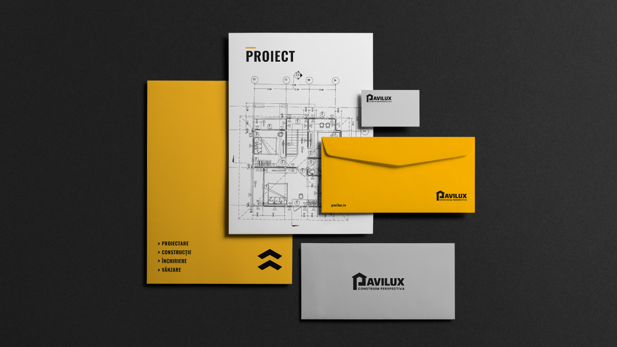
Stationery Design
Print Design
Urban Environmental Graphics/Signage
The Challenge
Our goal, after 15 years of activity, was to create an identity for the company that would preserve the essence of the brand while presenting it in a more modern way.
The Approach
Our design expression assigns a bold and singular meaning to the letter ‘P,’ visually manifesting into a distinctive and ownable language. This language establishes a link between their new identity and strategy, seamlessly integrating with their long-standing reputation. It is employed across the brand’s website, social media channels, and advertising campaigns to effectively communicate the brand’s sense of stability.
requires a lot of technical elements, but more than that it requires and future
